Apetito.
Rebranding of a favourite cheese brand.
Understanding how individual packaging elements subconsciously influence consumer behaviour resulted in record sales.
The challenge
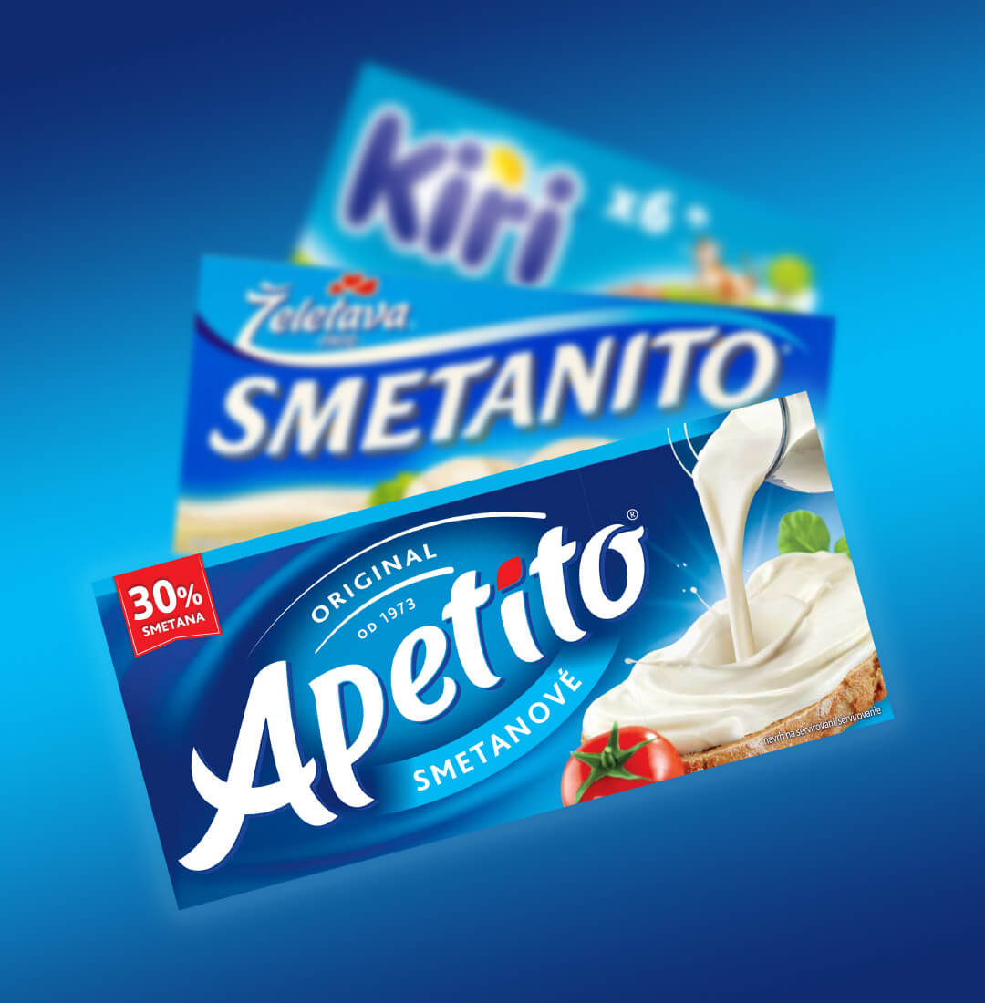
The market share of Apetito, a well-known and well-established cheese by Savencia, was declining.
The cheese was seen as interchangeable with its competitors, so brand building was a challenge.
Consumers steered away from any divergences from the category colour: blue.

The solution
We found a way to present Apetito as ‘blue’, without blue.
This allowed us to create a design that stood out from other similar products on the shelf.
And consumers responded: Sales were boosted significantly in the first three months, even without accompanying communication.
The discovery
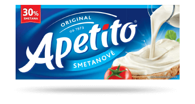
To find the winning solution, we had to understand the nimble and symbolic meanings of basic design components. Even small differences, such as adding a splash of green that represented freshness and nature, were key parts of the winning design.
As demonstrated below, the difference between success and failure is a very fine line. One we happily ended up on the right side of.
Original design
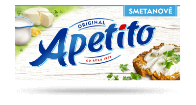
The new design that failed

The final and winning design
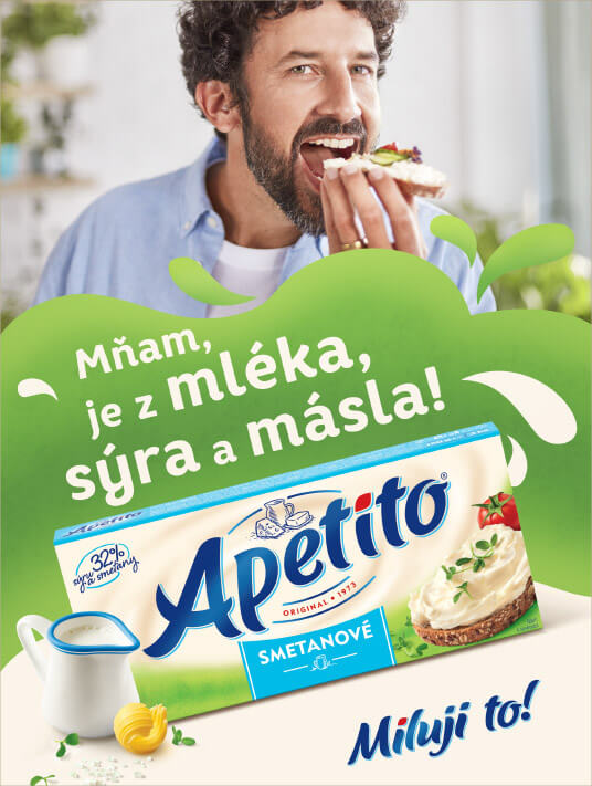
Apetito.
Above the (usual) line.
The amplification of brand attributes through colours, text, and sound resulted in record value share during the campaign, the highest of the last five years.
The challenge
The successful rebranding had to be communicated using a powerful ATL campaign that would boost sales significantly.

The solution
We used prominent elements of the visual identity that communicated the desired brand story, and used them to build a new spot and key visual.
It allowed us to strengthen the overall message, because the rational content was reinforced by a subconscious one, which aided in recognition of the product and its story at the point of sale, resulting in record market share.
The discovery
A brand’s key strategic attributes are communicated more effectively when all the visual and sound cues in the spot are used to amplify the desired message.
- The spot contained many phrases ending in ‘to’, to rhyme with Apetito: ‘Miluji to’ (I love it), etc.
- The overall colour tones of the spot.
- Thanks to previous analysis, we knew what we were saying with the individual colours, and what ratio of colours to use to tell the right story subliminally.


“We achieved record value share during the campaign, the highest of the last five years.”
David Vejtruba
Marketing Director, Savencia