Semtex.
In your own rythm.
Semtex found a way toadapt to each consumer’s needs and increase sales
The Problem
The energy drink category has been on a long-term rise, but Semtex was falling behind in the pace of growth and losing market share.
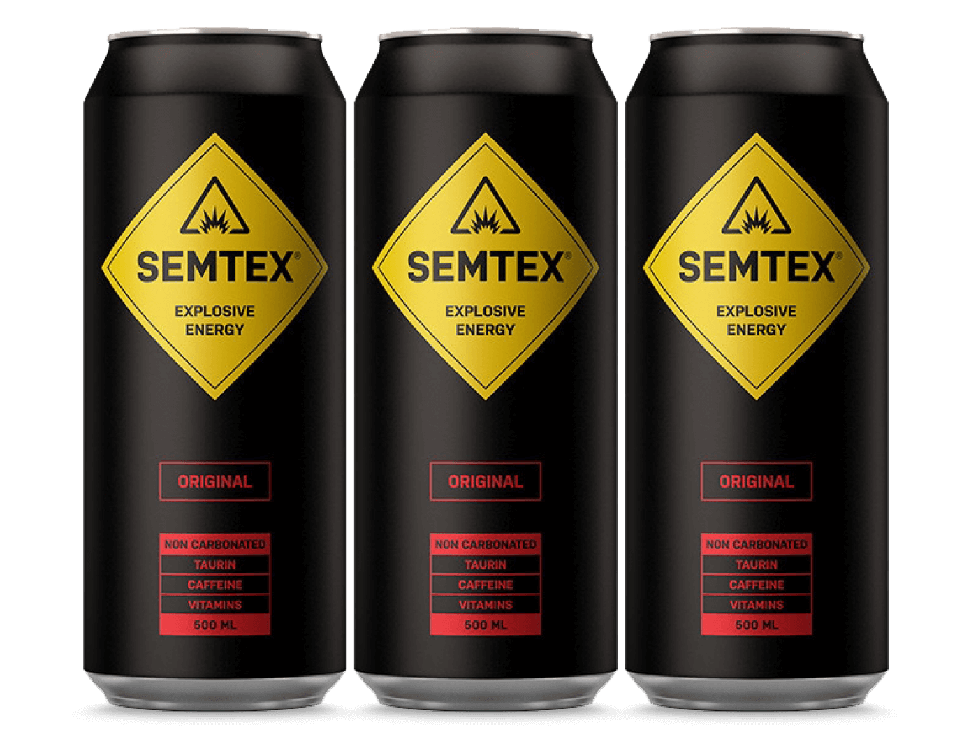
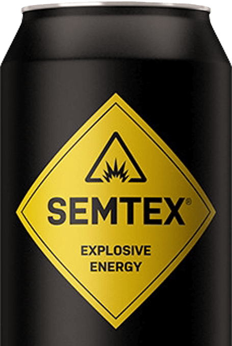
BEWARE!
DANGER!
Unpacking
To provide energy – this is the primary need of the energy drink category. Therefore, at the beginning of the project, we analyzed the brand using the „ScoreCard“ method, and it revealed that there is a lack of connection between the symbols on the packaging design and this elementary hygienic need.
The main association connected to the Semtex packaging was “CAUTION! DANGER!” And that was one of the main reasons why the brand fell behind.
Discovery
Addressing the primary needs was the first step. Another, no less important, was finding the brand‘s distinguishing proposition and translating it into symbols.
Our research showed us that the path of “specialized energy for different moments” was the one to choose.
Map of Symbols
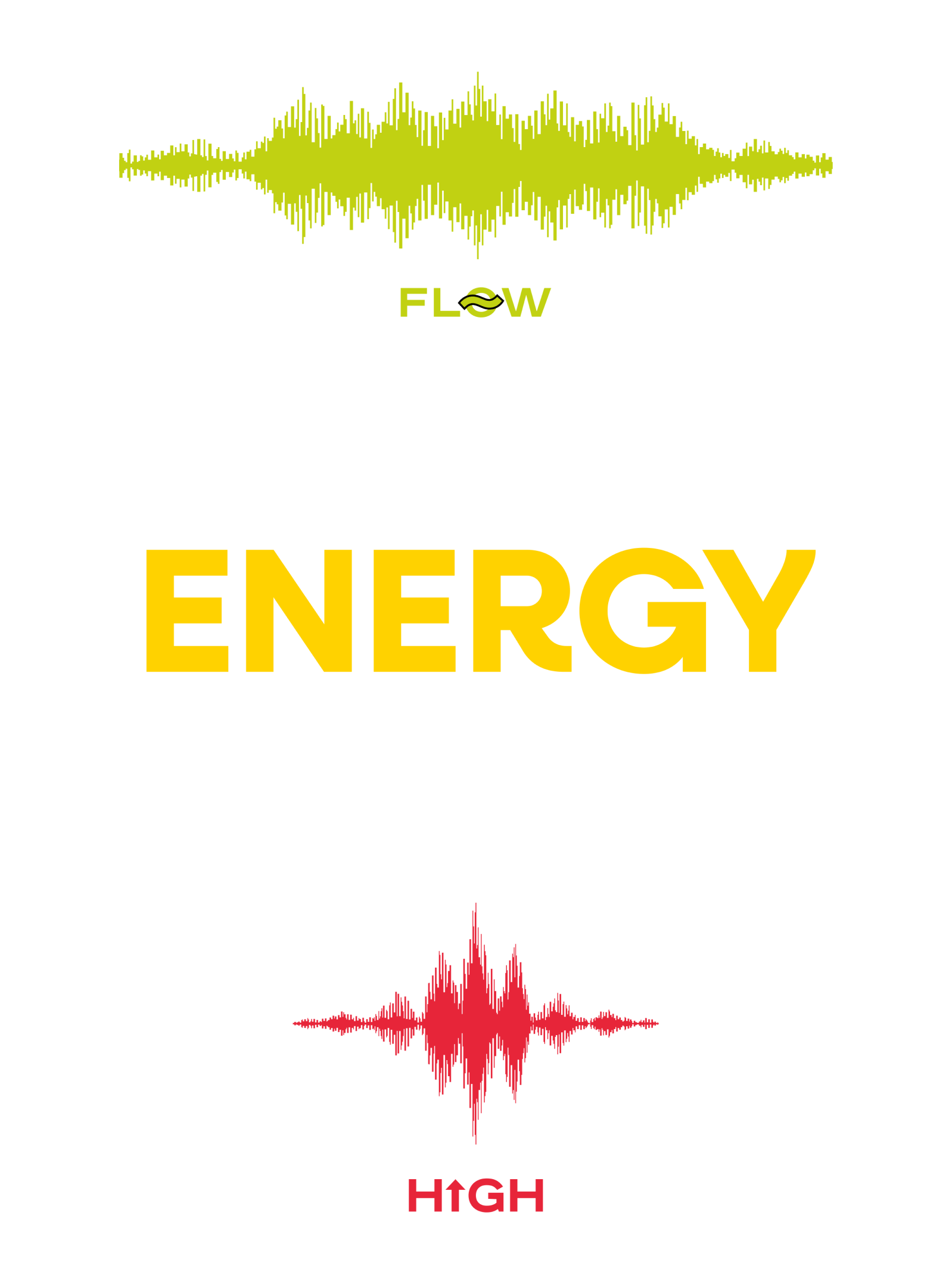
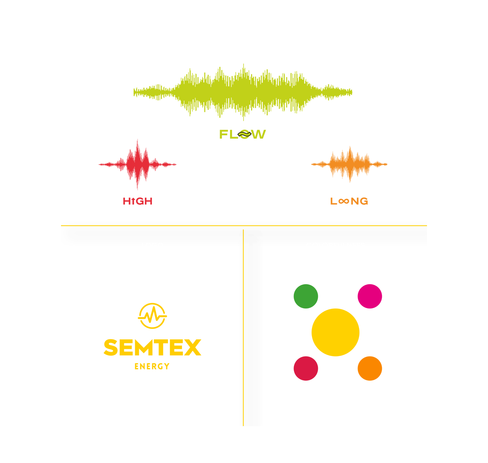
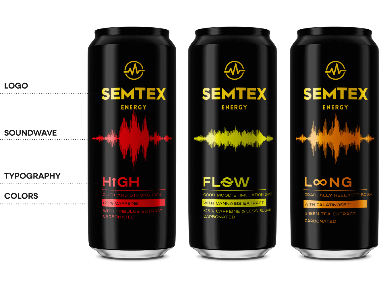
SOUNDWAVE
The replacement of the dominant „danger“ symbol with the „soundwave“ symbol improved the connection with the primary need for energy and increased the recognition of Semtex, allowing the differentiation of products according to the type of energy.
LOGO + TYPOGRAPHY
Expertise and trust of the brand is given by the new logo and font style, which defines the energy of specific products.
COLORFULNESS
The black and yellow color of the logo and cans built on the previous identity and held the „dark“ code of the category. Several complementary colors were chosen to identify the series.
The Solution
Various Soundwave characteristics were devised for the entire range to convey the specifics of the product – such as „LONG“ which evokes a long effect and „FLOW“ which represents concentration.
The redesign also included a change in packaging for the flavored versions.
The Solution
Prioritizing „soundwave“ on the packaging increased the distinctiveness of the brand and became the main bearer of the message.
In quantitative tests, the brand‘s design outclassed the previous design and outperformed the competition at the same time, which is a huge achievement for the new design.
The Results
Exceeding set business targets and increasing sales by 47% immediately in the first quarter after launch.

What the client said about our cooperation
„LineArt managed to find the perfect symbol — it addresses the basic need for energy, it’s unique and it resonates with consumers. This helped the design to be successful in tests and exceed its sale targets.“

Petr Kouble
Marketing manager, Kofola a.s.
